Best Wall Colors for Hardwood Floors: Dark & Light Guide
You’ve invested in beautiful hardwood flooring for your Kitchener-Waterloo, Cambridge, or Guelph home. The floors are installed, they look stunning, and now you’re standing in your empty room staring at the walls thinking: “What color do I paint these?”
This is one of the most common design dilemmas homeowners face after installing new floors. With thousands of paint colors available, the options feel overwhelming. Will a light color work? Should you go bold? What if you choose wrong and it clashes with your beautiful new floors?
Hi, I’m Hannad, your local flooring expert at Club Ceramic Flooring. Over the past decade, I’ve helped countless KW Region homeowners select hardwood floors, and I’ve heard every paint color question imaginable. I’ve also seen which combinations look stunning and which ones fall flat.
Here’s the good news: hardwood flooring is incredibly versatile. Wood is nature’s neutral, which means it works with almost any wall color you can imagine. The key is understanding a few basic principles about undertones, contrast, and balance.
In this guide, we’ll walk through the best wall colors for light, medium, and dark hardwood floors, explain why certain combinations work beautifully, help you avoid common mistakes, and give you the confidence to choose colors you’ll love for years to come.
But first, a quick tour of our Sheldon Drive (Cambridge) Showroom where you can see hardwood floor samples to visualize with wall colors:
The Golden Rule: Understanding Undertones
Before we dive into specific color recommendations, you need to understand the single most important concept in pairing wall colors with hardwood floors: undertones.
Every hardwood floor has an undertone — the subtle color that lies beneath the primary color you see. These undertones are either warm (red, orange, yellow) or cool (gray, blue, green).
Warm vs. Cool Hardwood Floors
Warm undertones: Most natural hardwoods fall into this category. Oak, hickory, maple, cherry, and walnut typically have warm undertones with hints of red, orange, or golden yellow.
Cool undertones: Less common but increasingly popular. Whitewashed woods, gray-stained floors, and certain ash varieties have cool undertones with hints of gray or blue.
Why This Matters for Wall Colors
The principle is simple: warm undertones pair best with warm wall colors, and cool undertones pair best with cool wall colors.
When you match the temperature of your wall color to your floor’s undertone, the room feels cohesive and intentional. When you fight the undertones (warm floors with very cool walls), the room can feel disjointed or uncomfortable, even if you can’t quite identify why.
The Undertone Test
Not sure about your floor’s undertone? Try this:
- Look at your hardwood in natural daylight (not artificial light)
- Compare it to a pure white piece of paper
- Does the wood look golden, reddish, or orangish? That’s warm
- Does it look grayish, bluish, or ashy? That’s cool
Understanding your floor’s undertone is the foundation for making smart wall color choices.
The #1 Mistake to Avoid
Before we get into what DOES work, let’s address what definitely DOESN’T work: matching your wall color too closely to your floor color.
This is the most common mistake homeowners make, and it’s understandable why it happens. You think, “My floors are a medium brown, so medium brown walls should coordinate nicely, right?”
Wrong.
Why Matching Creates Problems
When your wall color is too similar to your floor color, everything blends together in a monotone wash. There’s no visual separation, no contrast, no definition. The room feels flat, boring, and lacks dimension.
Imagine wearing a tan shirt with tan pants and tan shoes. Sure, everything “matches,” but it’s also incredibly boring and does nothing to create visual interest.
The Real Example
A homeowner installs beautiful natural red oak floors with warm honey tones. Then they paint the walls a beige-brown that’s similar in tone to the flooring. The result? A room where walls and floors blur together, making the space feel smaller and uninspiring.
What You Need Instead
You want either clear contrast (light walls with dark floors, or vice versa) or distinct color differentiation (warm wood floors with green or blue walls rather than brown walls).
Think of your floors and walls as partners in a dance — they should complement each other, not compete, but they also shouldn’t blend into one indistinguishable mass.
Light Hardwood Floors: Maximum Flexibility
If you have light-colored hardwood floors, congratulations — you’ve got the most versatility when it comes to wall colors. Light floors are like wearing jeans: they go with almost everything.
What Qualifies as Light Hardwood
- Natural maple or ash
- White oak or pale oak
- Whitewashed or pickled finishes
- Light gray-stained wood
- Scandinavian-style pale woods
- Any floor that’s lighter than medium brown
Best Wall Color Options
Crisp Whites and Off-Whites
Why it works: Light floors with white walls create a bright, airy, modern aesthetic that maximizes natural light and makes spaces feel larger.
Popular choices:
- Benjamin Moore Cloud White — warm white that doesn’t feel stark
- Benjamin Moore Swiss Coffee — creamy white with subtle warmth
- Benjamin Moore Chantilly Lace — crisp, clean white for modern spaces
- Sherwin Williams Alabaster — versatile warm white
Perfect for: Modern homes, Scandinavian style, open-concept layouts, maximizing natural light
KW consideration: Excellent choice for Cambridge basement spaces with light floors where you want to combat the naturally darker environment.
Soft Grays
Why it works: Gray walls with light floors create a sophisticated, contemporary look that feels current and stylish.
Popular choices:
- Benjamin Moore Gray Owl — soft, warm gray (one of the most popular)
- Benjamin Moore Revere Pewter — warm greige (gray-beige blend)
- Benjamin Moore Stonington Gray — slightly cooler but still versatile
- Sherwin Williams Agreeable Gray — warm gray that works with most floors
Important note: If your light floors have warm undertones, choose grays with warm undertones too. Avoid very cool grays that can clash.
Perfect for: Open-concept KW homes, modern Kitchener townhouses, contemporary style
Greiges (Gray-Beige Blends)
Why it works: Greige is the perfect bridge between warm and cool, making it incredibly versatile with light hardwood.
Popular choices:
- Sherwin Williams Accessible Beige — warm greige that’s universally flattering
- Sherwin Williams Agreeable Gray — leans slightly gray but still warm
- Benjamin Moore Revere Pewter — classic greige
Perfect for: Transitional style homes, when you can’t decide between gray and beige, spaces with mixed lighting
Bold Colors (Yes, You Can!)
Why it works: Light floors give you the freedom to go bold on walls because you’re starting with a neutral, light base. The floor won’t compete with dramatic wall colors.
Options to consider:
- Navy blue — creates sophisticated drama
- Deep emerald or forest green — rich and elegant
- Charcoal gray — moody and modern
- Black accent wall — maximum contrast (works in well-lit spaces)
- Deep teal or sapphire — jewel tones that pop
Perfect for: Statement walls, dining rooms, bedrooms, home offices, spaces with excellent natural light
What to Avoid with Light Floors
- Very yellow or orange-toned walls (can look dated, especially with cool-toned light floors)
- Browns that are similar to the floor tone (even with light floors, this creates monotony)
Medium Hardwood Floors: The Sweet Spot
Medium-toned hardwood is the most common flooring choice in KW Region homes. It’s versatile, classic, and works with both traditional and modern design styles.
What Qualifies as Medium Hardwood
- Natural oak (red or white)
- Hickory with natural finish
- Medium-stained maple
- Warm honey-toned woods
- Most common “natural wood” finishes
If your floor is neither very light nor very dark, you’re in this category.
Best Wall Color Options
Warm Whites and Creams
Why it works: Warm whites complement the warm undertones found in most medium hardwoods, creating a clean, classic look without stark contrast.
Popular choices:
- Benjamin Moore Mascarpone — decadent cream tone
- Sherwin Williams Alabaster — warm white that works everywhere
- Benjamin Moore Navajo White — soft, warm neutral
- Sherwin Williams Greek Villa — warm, inviting white
Perfect for: Family homes, traditional style, classic interiors, when you want clean but not stark
Greens (The Unexpected Winner)
Why it works: This might surprise you, but green is one of the most recommended colors for medium hardwood floors. Why? Because wood and green appear together in nature, so our brains naturally find the combination pleasing and harmonious.
Popular choices:
- Sherwin Williams Clary Sage — soft, sophisticated sage
- Benjamin Moore Saybrook Sage — calming green-gray
- Benjamin Moore Retreat — spa-like soft green
- Deeper options: olive green, forest green for bolder spaces
Perfect for: Calming bedrooms, living rooms, creating a nature-inspired palette, modern farmhouse style
This combination is mentioned repeatedly by designers and homeowners as a favorite pairing with natural oak floors.
Blue-Greens and Teals
Why it works: These colors create a sophisticated, unexpected look that feels both coastal and contemporary.
Popular choices:
- Benjamin Moore Aegean Teal — rich, jewel-toned teal
- Sherwin Williams Copen Blue — soft blue-green
- Various seafoam and aqua tones
Perfect for: Bathrooms, bedrooms, accent walls, creating a fresh, modern vibe
Soft Grays (Warm-Toned)
Why it works: Gray can work beautifully with medium hardwood IF you choose grays with warm undertones that complement the wood’s warmth.
Important: Avoid cool grays with blue or purple undertones — they’ll clash with warm wood floors.
Popular choices:
- Warm grays with beige undertones (greiges)
- Benjamin Moore Revere Pewter — warm greige
- Sherwin Williams Accessible Beige — greige that leans warm
Perfect for: Modern homes wanting a neutral palette, transitional style
Dramatic Darks (For the Bold)
Why it works: If you love drama and have good natural light, dark walls with medium floors create a moody, sophisticated atmosphere.
Options:
- Charcoal gray
- Navy blue
- Deep forest green
- Benjamin Moore Dark Harbor (dramatic and statement-making)
Best in: Rooms with excellent natural light, dining rooms, home offices, libraries, accent walls
Avoid in: Small rooms with limited light (will feel cave-like)
What to Avoid with Medium Floors
- Browns and beiges that are too similar to your floor color (the matching mistake)
- Very cool grays without warm undertones (creates visual discord)
- Orangey or yellow-toned beiges (can look dated with natural oak)
Dark Hardwood Floors: Strategic Color Choices
Dark hardwood floors are dramatic, elegant, and sophisticated. They also present the most challenging wall color decisions because the wrong choice can make a room feel like a cave.
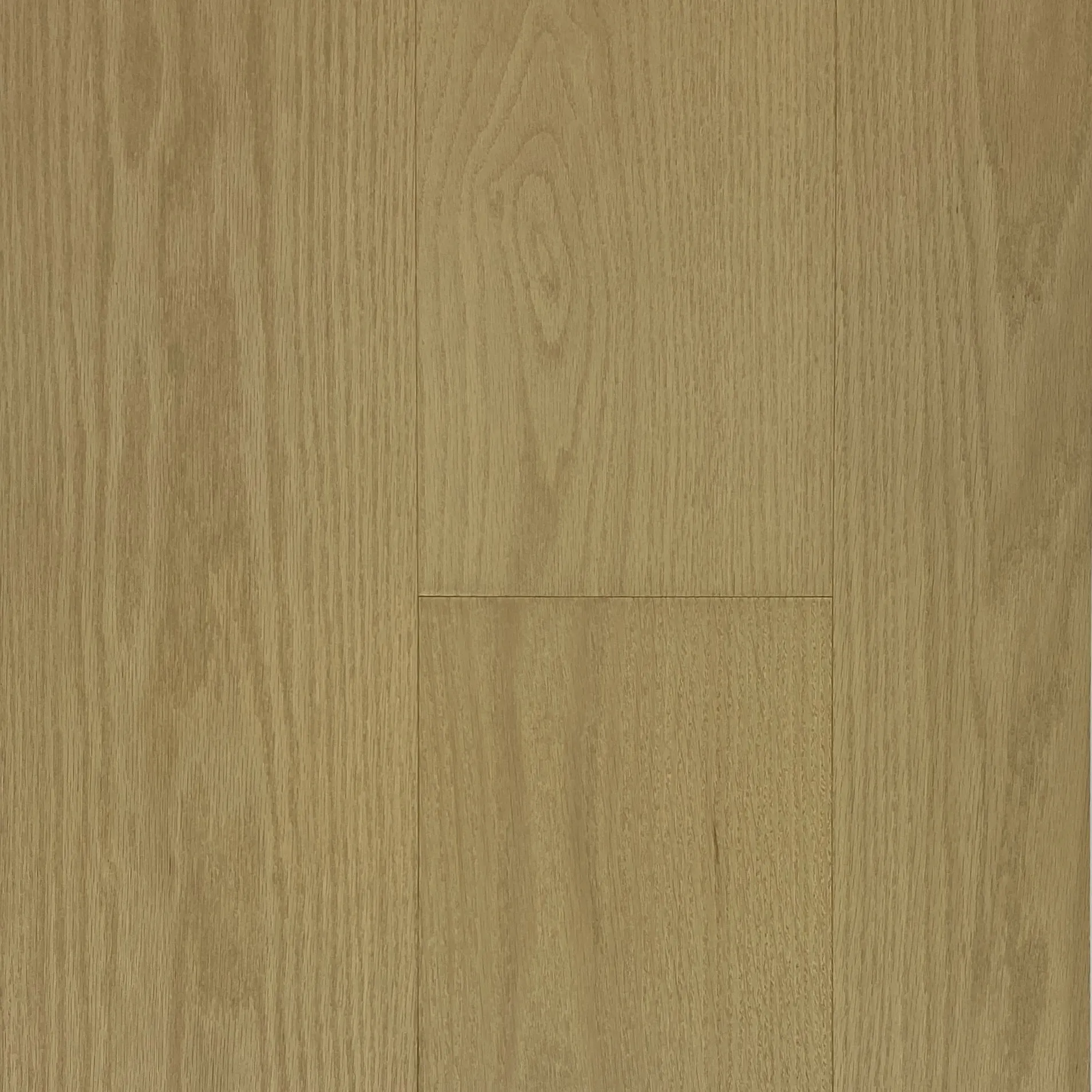
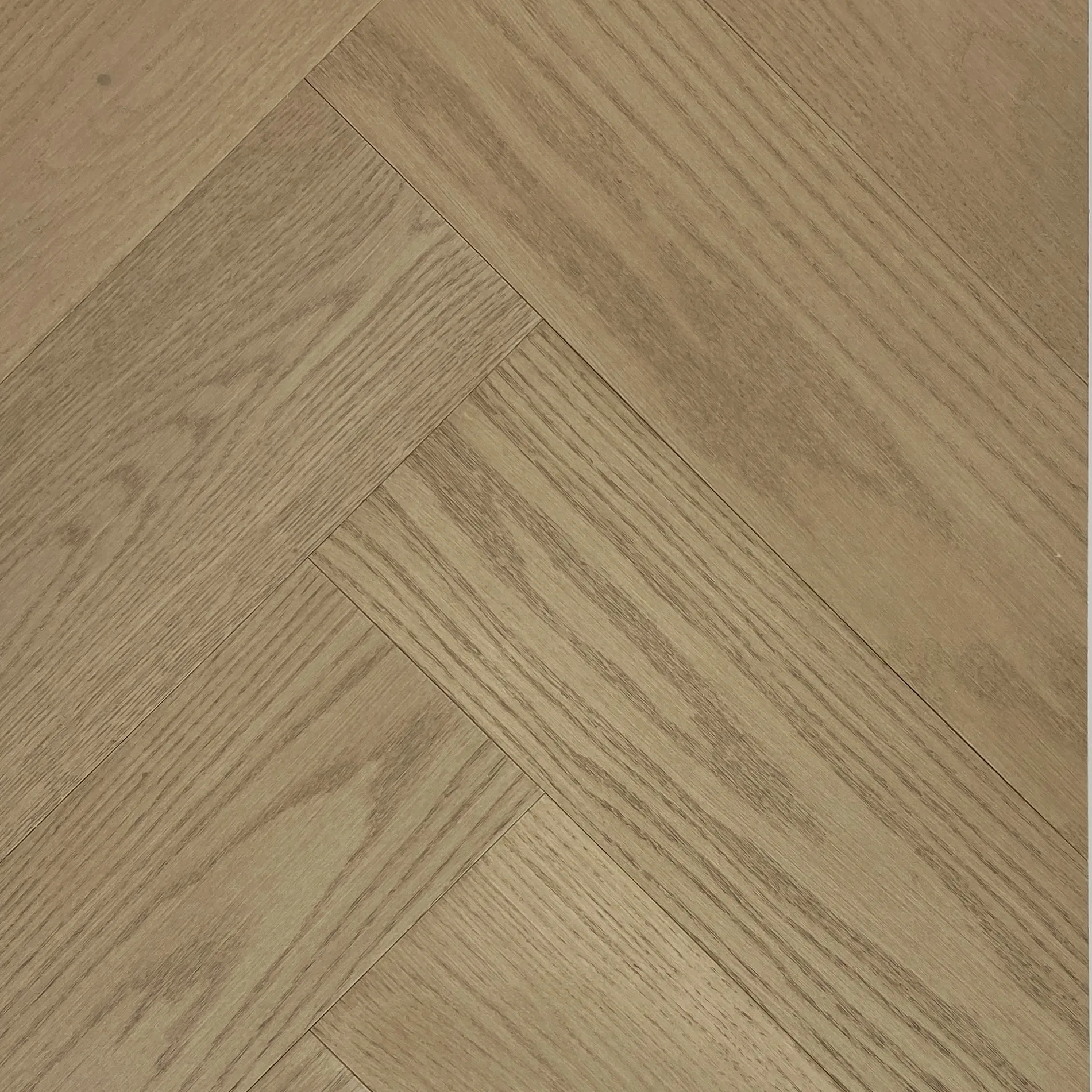
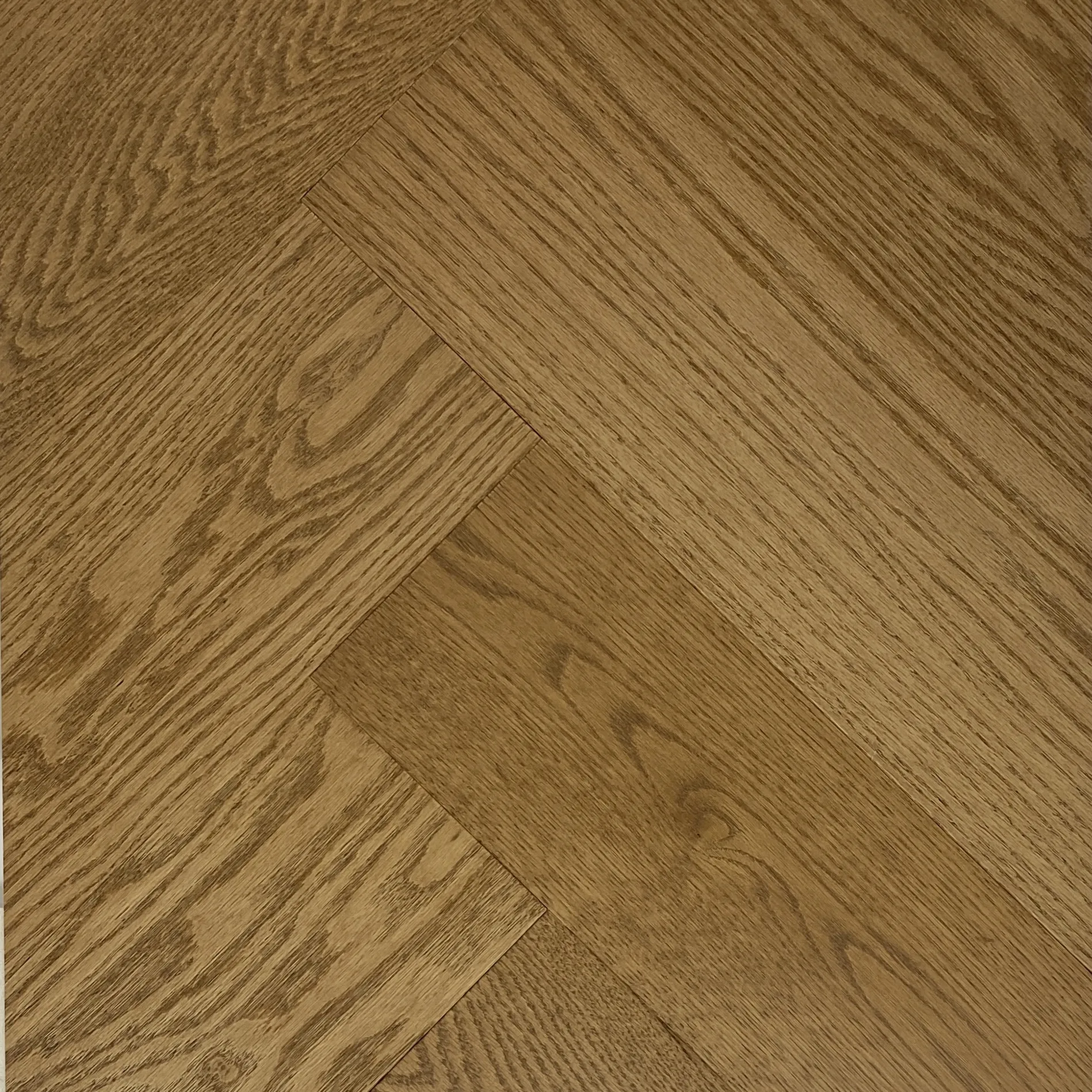
What Qualifies as Dark Hardwood
- Walnut
- Dark-stained oak
- Espresso or ebony finishes
- Brazilian cherry (Jatoba)
- Mahogany
- Any floor that’s dark brown or near-black
The Dark Floor Challenge
Dark floors absorb light rather than reflect it. If you also choose dark walls, you can create a space that feels oppressively small, dim, and closed-in — especially problematic in KW Region homes where natural light can be limited during winter months.
The solution? Strategic wall color choices that create contrast and balance.
Best Wall Color Options
Light and Bright (The Safe Choice)
Why it works: White or off-white walls with dark floors create maximum contrast, visually expanding the space and preventing the “cave” effect.
Popular choices:
- Bright whites for maximum contrast
- Warm whites to soften the look
- Creamy off-whites for a less stark appearance
- Benjamin Moore Cloud White
- Sherwin Williams Pure White
Perfect for: Small rooms, spaces with limited natural light, most dark floor applications, classic elegant look
This is the safest, most foolproof choice with dark floors.
Soft Neutrals
Why it works: If stark white feels too intense, soft neutrals provide contrast without being quite so dramatic.
Popular choices:
- Light grays
- Pale greiges
- Soft taupes
- Benjamin Moore Gray Owl
- Sherwin Williams Gossamer Veil
Perfect for: Bedrooms, living rooms with good natural light, elegant sophisticated spaces
Bold Colors (With Caution)
Why it CAN work: If you have excellent natural light and love drama, bold wall colors with dark floors create an incredibly luxurious, enveloping atmosphere.
Requirements:
- Large rooms (minimum 12×12 feet)
- Excellent natural light from large windows
- Good artificial lighting plan
- Bold personality willing to commit
Color options:
- Deep jewel tones: emerald green, sapphire blue, burgundy
- Rich navy
- Deep charcoal
Best in: Large living rooms with lots of windows, dining rooms, master bedrooms in newer homes with good light
Avoid in: Small rooms, basements, spaces with limited natural light, north-facing rooms
Warm Tones (Carefully)
Why it works: Soft yellows, peachy creams, and warm beiges can create a cozy, inviting atmosphere with dark floors, but they must be significantly lighter than the floor.
Popular choices:
- Soft buttery yellows
- Warm peachy creams
- Light warm beiges (much lighter than the floor)
- Benjamin Moore Morning Sunshine
Perfect for: North-facing rooms that need warmth, cozy bedrooms, traditional style homes
What to Avoid with Dark Floors
- Dark walls in small rooms (creates oppressive cave effect)
- Very cool tones without excellent lighting (feels cold and uninviting)
- Any brown similar to or darker than your floor color
- Medium-toned colors that don’t provide enough contrast
Special Considerations for KW Region Homes
Wall color choices aren’t just about the flooring — they’re also about your specific home’s architecture, natural light, and regional characteristics.
Older Cambridge Homes
Many Cambridge properties are older bungalows and heritage homes with:
- Smaller rooms with lower ceilings
- Less natural light than modern construction
- Original architectural details like wood trim and moldings
- North-facing rooms common
Recommendation: Stick to lighter wall colors with medium or dark floors to maximize brightness and make rooms feel larger. Traditional color palettes work beautifully with original architectural character.
Kitchener Rowhouses and Townhomes
Attached homes in Kitchener often feature:
- Limited natural light (shared walls reduce window placement)
- Open-concept main floors
- Modern finishes in newer construction
Recommendation: Light walls throughout main living areas maximize available natural light. Open concept spaces work well with consistent neutral tones. Bolder colors can work in well-lit bedrooms.
Guelph Properties
Guelph features a mix of heritage homes and new construction:
- Heritage homes: traditional architecture, smaller windows, character details
- New builds: modern layouts, excellent natural light, open concepts
Recommendation: Heritage homes benefit from traditional color palettes that respect original character. New builds offer more flexibility for modern, bold color choices.
Natural Light Direction Matters
North-facing rooms: Receive cooler, indirect light. Choose warmer wall colors to add coziness and counter the cool light.
South-facing rooms: Receive abundant warm light throughout the day. Can handle cooler wall tones without feeling cold. Best rooms for bold color experiments.
East-facing rooms: Bright morning light, dimmer afternoons. Consider when you use the room most — morning (can handle cooler tones) or evening (needs warmth).
West-facing rooms: Strong afternoon and evening light. Can handle a range of colors but be mindful of how they look in evening light when you’re typically home.
The Role of Trim and Doors
Your wall color doesn’t exist in isolation — it needs to work with both your floors AND your trim, doors, and moldings.
White Trim (Most Common)
White trim is the most popular choice in modern and updated homes.
Advantages:
- Creates clean separation between walls and floors
- Works with almost any wall color
- Makes rooms feel fresh and bright
- Modern and timeless
Works with: Any hardwood floor color, any wall color
Wood Trim
Common in older KW Region homes, especially Cambridge heritage properties.
Challenge: Your wall color must work with BOTH the floor color and the trim color.
Solution:
- Usually best to go lighter and more neutral on walls
- Let the wood trim and floors be the warm elements
- Avoid wall colors too similar to either the floor or trim
- Soft whites, warm grays, and greiges work well
Dark Trim
A bold modern choice creating strong contrast.
Consideration: Wall color needs to bridge the floor and trim, providing transition between the two.
Works best with: Light to medium floors with dark trim and medium-toned walls, or dark floors with dark trim and light walls for maximum contrast.
Matching Paint to Your Decor (Not Just Floors)
Here’s a perspective shift that will make your color selection easier: don’t match paint to floors. Match paint to your overall decor.
The Smarter Approach
Step 1: Choose flooring first (it’s expensive and a 20+ year commitment)
Step 2: Select furniture, rugs, artwork, and decor second (these express your personal style)
Step 3: Choose paint last (it’s the easiest and cheapest element to change)
Step 4: Let your paint color tie together the floors and furnishings
Why This Matters
Paint costs $50 per gallon and can be changed in a weekend. Hardwood floors cost thousands and last 20+ years. Furniture represents significant investment and reflects your personal style.
It’s far easier to choose a paint color that coordinates with a beautiful area rug, a piece of art you love, or your existing furniture than trying to buy all new decor to match a paint color you picked first.
The Process
Once your floors are installed and your main furniture pieces are in place, bring paint samples into the room. Look for colors that:
- Complement your floor’s undertones
- Coordinate with your furniture
- Pick up accent colors from rugs or artwork
- Create the mood you want in the space
Room-Specific Considerations
Different rooms have different needs when it comes to wall colors with hardwood floors.
Open Concept Spaces
When your hardwood flows through multiple connected areas (living room, dining room, kitchen), wall color strategy matters:
Option 1: Consistent color throughout — Creates cohesive flow and makes the space feel larger
Option 2: Varying tones within same color family — Can define different zones while maintaining harmony
Avoid: Drastically different wall colors in connected spaces (creates visual chaos)
Hallways and Dark Spaces
Hallways, especially in older homes, often lack natural light and feel narrow.
Solution: Always go lighter than you think you should. A dark hallway with any floor color creates a cave-like, unwelcoming feel.
Best choices:
- Bright whites
- Soft, light neutrals
- Use mirrors to reflect light
- Ensure good overhead lighting
Bedrooms
Bedrooms offer more flexibility because they’re private spaces where personal preference reigns.
Consider:
- Calming colors for better sleep (soft blues, greens, warm neutrals)
- Can go bolder or more dramatic than main living spaces
- Consider mood you want: energizing or relaxing
- Natural light less critical since you primarily use the room at night
Kitchens
Kitchens typically have less wall space (covered by cabinets and backsplash), so wall color is less dominant.
Popular choices:
- White or off-white (most common, keeps focus on cabinets)
- Light neutrals
- Let backsplash tile or colorful cabinets add interest instead
Testing Before Committing
This is the most important step that many homeowners skip: actually testing paint colors in your space before committing to entire rooms.
The Proper Testing Process
Step 1: Buy sample pots — Purchase small sample sizes of 3-5 colors you’re considering (usually $5-10 each)
Step 2: Paint large swatches — Paint sections at least 2×2 feet on multiple walls (not tiny swatches — you need to see the color at scale)
Step 3: View in all lighting conditions — Look at your samples in morning light, afternoon light, and evening artificial light
Step 4: Live with them — Leave the samples up for at least 3-5 days. Notice how you feel in the space. Does one color consistently look better?
Step 5: Check with furnishings — Place your samples near your furniture, rugs, and decor. Do they enhance or clash?
What to Look For During Testing
- Does it complement or clash with your floor’s undertones?
- Does the room feel bigger or smaller with this color?
- Do you still like it in different lighting conditions?
- Does it work with your furniture and decor?
- Does it feel like YOU?
The $25-50 you spend on sample pots will save you from painting entire rooms in a color you end up hating.
Popular Color Combinations That Work
Based on successful installations and designer recommendations, here are proven winning combinations:
With Light Floors
- Light maple + soft gray — Modern, sophisticated, Scandinavian-inspired
- White oak + crisp white — Bright, airy, minimalist elegance
- Pale ash + navy accent wall — Bold contrast with contemporary edge
- Whitewashed pine + greige — Warm, inviting, transitional style
With Medium Floors
- Natural oak + sage green — Nature-inspired, calming, universally flattering
- Honey oak + warm white — Classic, clean, timeless
- Red oak + soft teal — Unexpected, sophisticated, coastal vibe
- Hickory + warm gray — Contemporary neutral with organic warmth
With Dark Floors
- Walnut + bright white — Maximum contrast, elegant, dramatic
- Espresso + soft cream — Sophisticated without stark contrast
- Dark oak + light greige — Modern, neutral, balanced
- Brazilian cherry + pale gray — Contemporary, lets rich floor shine
Current Trends vs. Timeless Choices
It’s helpful to understand what’s trending now versus what will look good for decades.
Trending Now
- Sage green with natural wood — Everywhere in 2023-2024, nature-inspired palettes
- Warm whites and creams — Replacing cool grays as the go-to neutral
- Greiges — Gray-beige blends that bridge warm and cool
- Moody dark colors — In well-lit spaces for drama and sophistication
- Warm, earthy terracottas — With light floors for Mediterranean vibes
Timeless Classics
- White or off-white with any floor — Never goes out of style
- Soft neutral grays — Modern but not trendy
- Warm beiges and taupes — Classic, comfortable, safe
- Nature-inspired greens — Always feel organic and right with wood
What to Avoid (Dated Looks)
- Builder beige everywhere — The bland, tan-beige from 2000s construction
- Orange-toned walls — Popular in the 1970s-90s, looks dated now
- Matching walls exactly to floors — Creates flat, boring spaces
- Very cool grays with warm floors — The clash is obvious and uncomfortable
The Bottom Line: Trust Your Instincts
After all this guidance, here’s the most important thing to remember: your home should reflect your personal style and make you happy.
Key Principles to Remember
- Hardwood is neutral and works with most colors
- Avoid matching wall color too closely to floor color
- Consider undertones (warm with warm, cool with cool)
- Lighter walls with darker floors for small spaces
- Test colors in your actual space before committing
- Match paint to your overall decor, not just floors
When to Break the Rules
Do you absolutely love a color even though it “breaks the rules”? Try it anyway. Here’s why:
- Life’s too short for boring, safe beige
- Paint is easy and affordable to change
- Your home should express your personality
- Sometimes rule-breaking creates the most interesting spaces
The “rules” we’ve discussed are guidelines based on what typically works well. They’re not laws. If you love a color and it makes you happy when you test it in your space, that’s what matters most.
Popular Paint Brands and Specific Colors
For reference, here are specific paint colors frequently recommended with hardwood floors:
Benjamin Moore
Whites and Creams:
- Cloud White — warm, versatile white
- Swiss Coffee — creamy, not stark
- Chantilly Lace — crisp, clean white
- Mascarpone — decadent cream
Grays and Greiges:
- Gray Owl — soft warm gray (extremely popular)
- Revere Pewter — classic warm greige
- Stonington Gray — versatile gray
Greens:
- Saybrook Sage — calming sage
- Retreat — spa-like green
- Aegean Teal — rich blue-green
Sherwin Williams
Whites and Neutrals:
- Alabaster — warm, versatile white
- Greek Villa — warm white
- Accessible Beige — warm greige
- Agreeable Gray — soft warm gray
Greens and Blues:
- Clary Sage — sophisticated soft green
- Copen Blue — soft blue-green
Dramatic Colors:
- Naval — rich navy for bold spaces
Where to Get Paint Samples in KW Region
- Local Benjamin Moore retailers in Cambridge, Kitchener, Guelph
- Sherwin Williams stores
- Home Depot and Lowe’s (Behr and other brands)
Always test multiple colors in your actual space before buying gallons.
Conclusion
Choosing wall colors for your hardwood floors doesn’t have to be overwhelming. Remember that hardwood is incredibly versatile — it’s nature’s neutral that works with almost any color palette.
The key principles are simple: understand your floor’s undertones, avoid matching walls too closely to floors, create appropriate contrast based on how light or dark your floors are, and always test colors in your actual space before committing.
Light floors give you maximum flexibility to go bold or stay neutral. Medium floors work beautifully with warm whites, greens, and soft grays. Dark floors need lighter walls to prevent cave-like spaces, but can handle drama in well-lit rooms.
Most importantly, choose colors that make YOU happy. Your home in Kitchener-Waterloo, Cambridge, or Guelph should reflect your personal style and create spaces where you feel comfortable and inspired.
At Club Ceramic Flooring, we help KW Region homeowners visualize how different hardwood floors will look in their homes. Visit our showroom to see floor samples and discuss how different tones will work with your planned wall colors. We’ll help you make choices you’ll love for years to come.
Call to Action
📍 Visit us: 15 Sheldon Dr, Cambridge, ON
📞 Call: (647) 394-6030
🌐 Website: clubceramiccambridge.ca
Planning your flooring and paint colors? Visit our Cambridge showroom to see hardwood samples in person and discuss how different floor tones will work with your design vision. We’ll help you create the perfect foundation for your beautiful space!
